x and o's
details
- type[logo & packaging]
- year2025
project overview
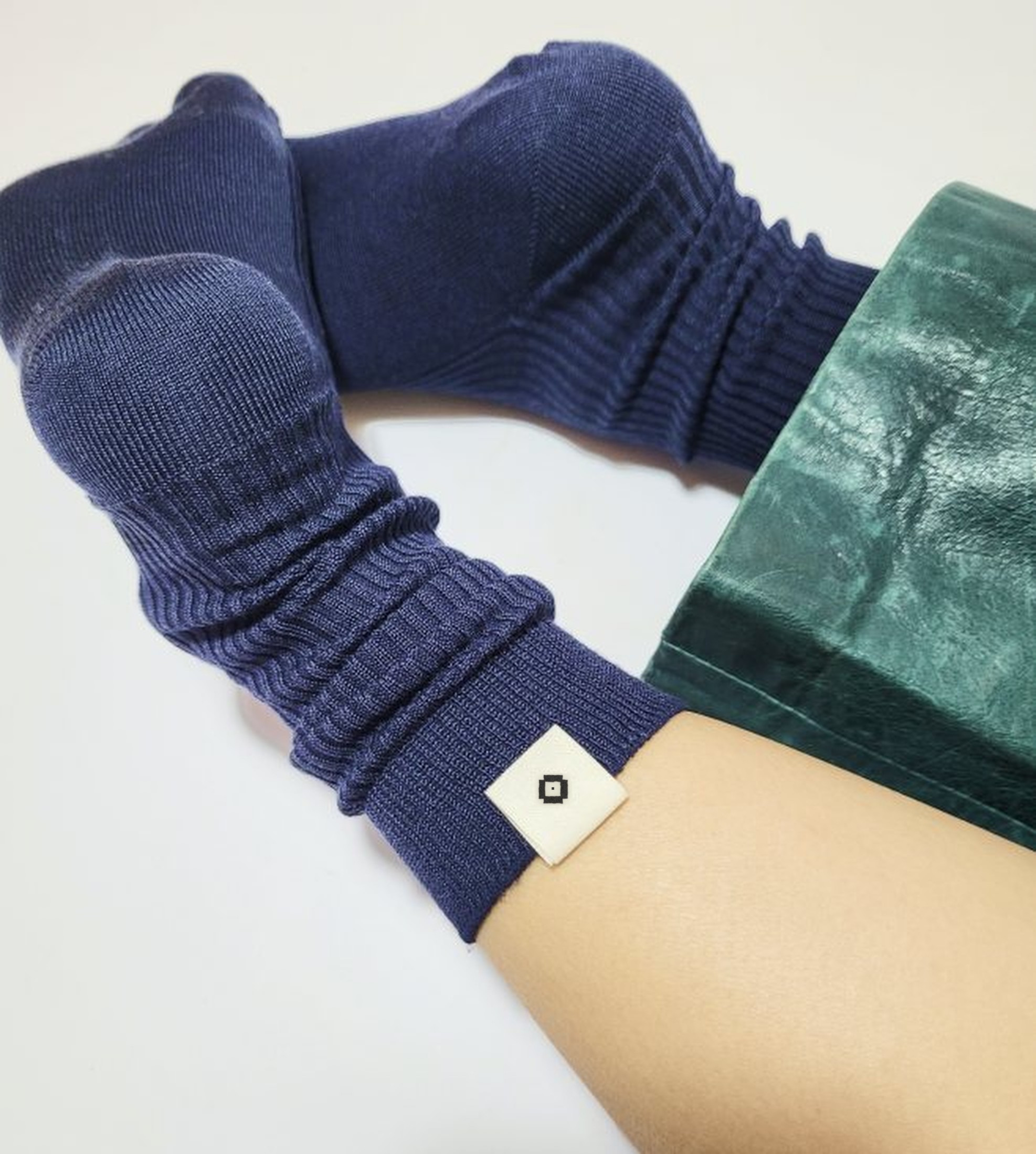
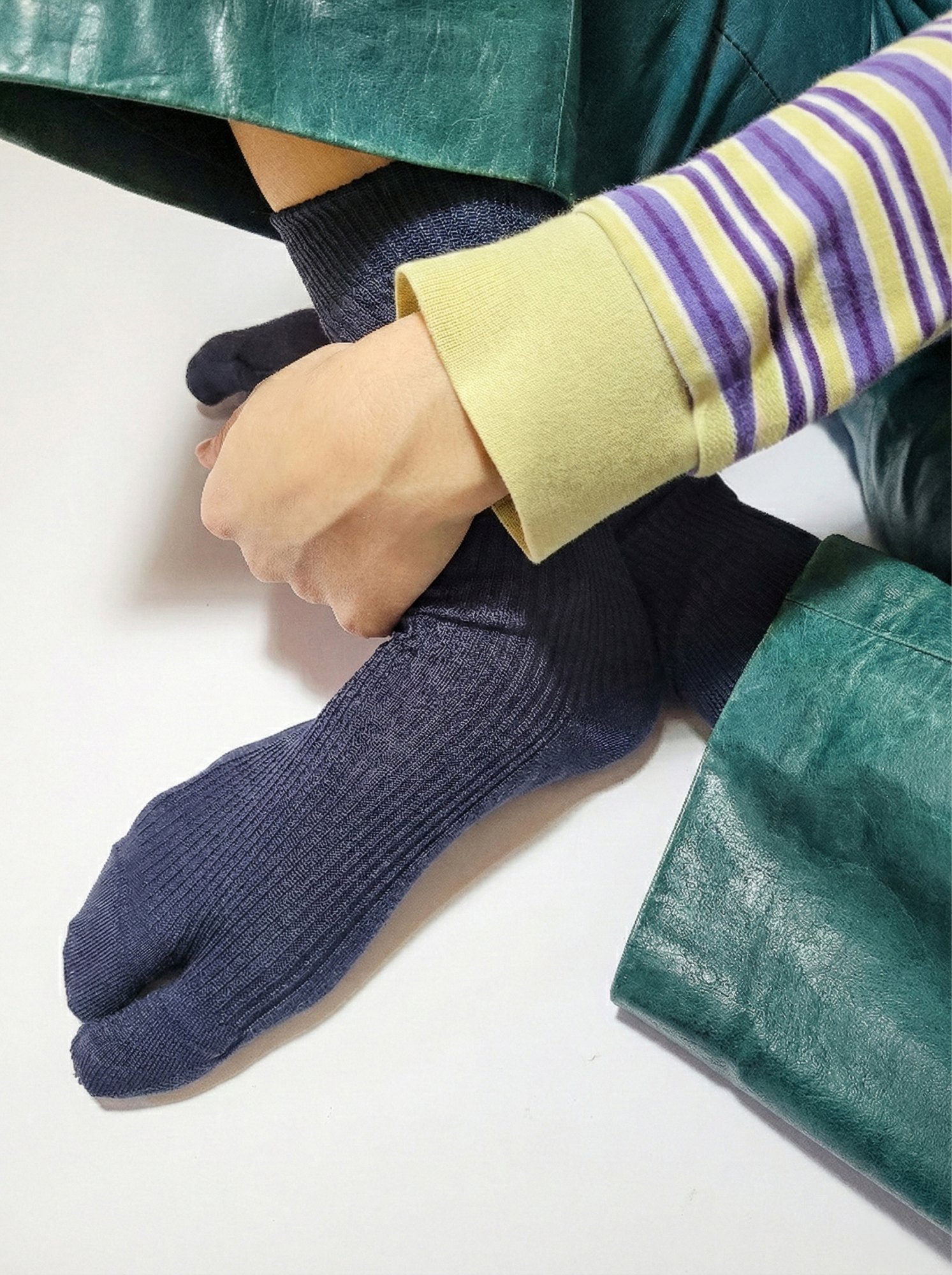
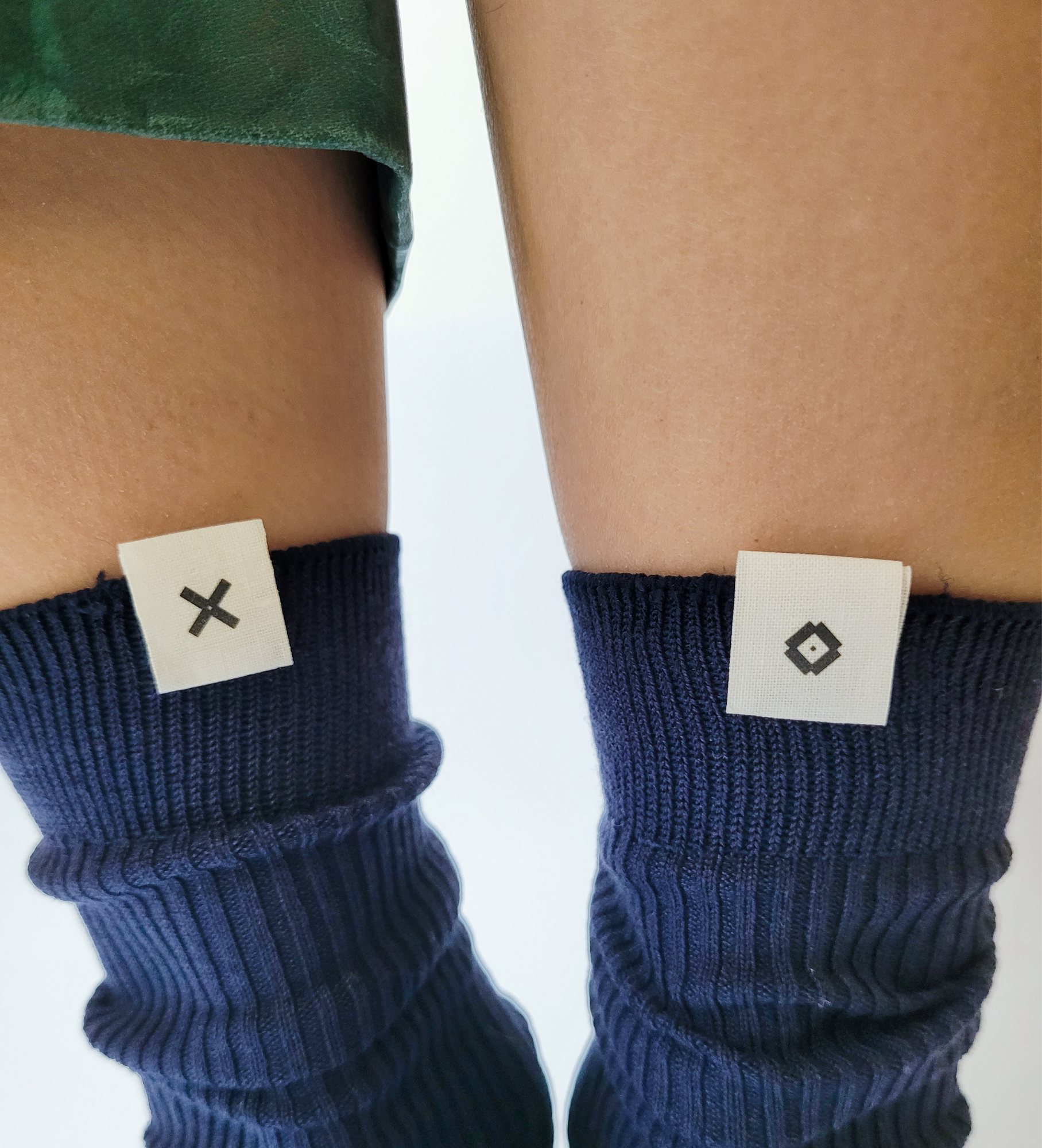
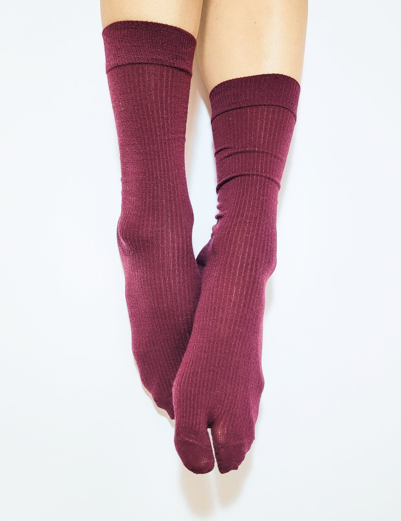
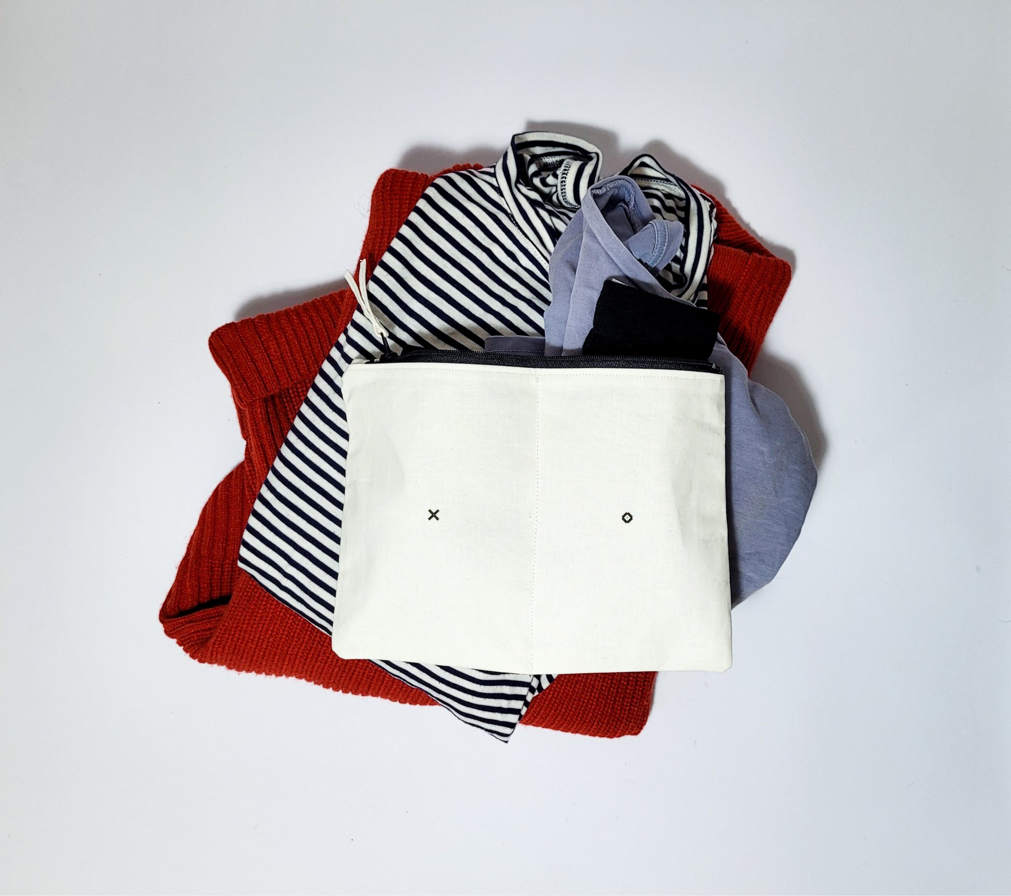
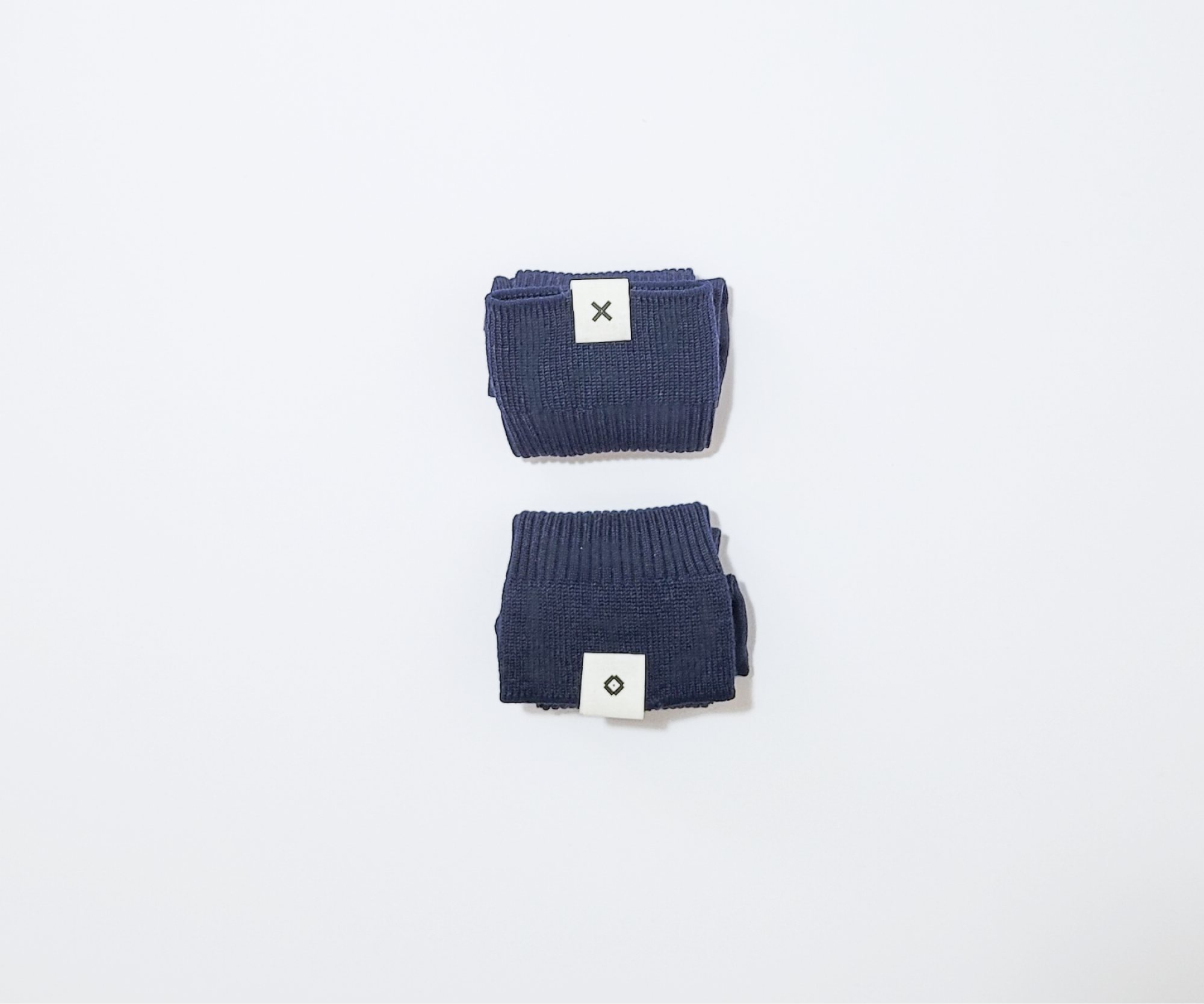
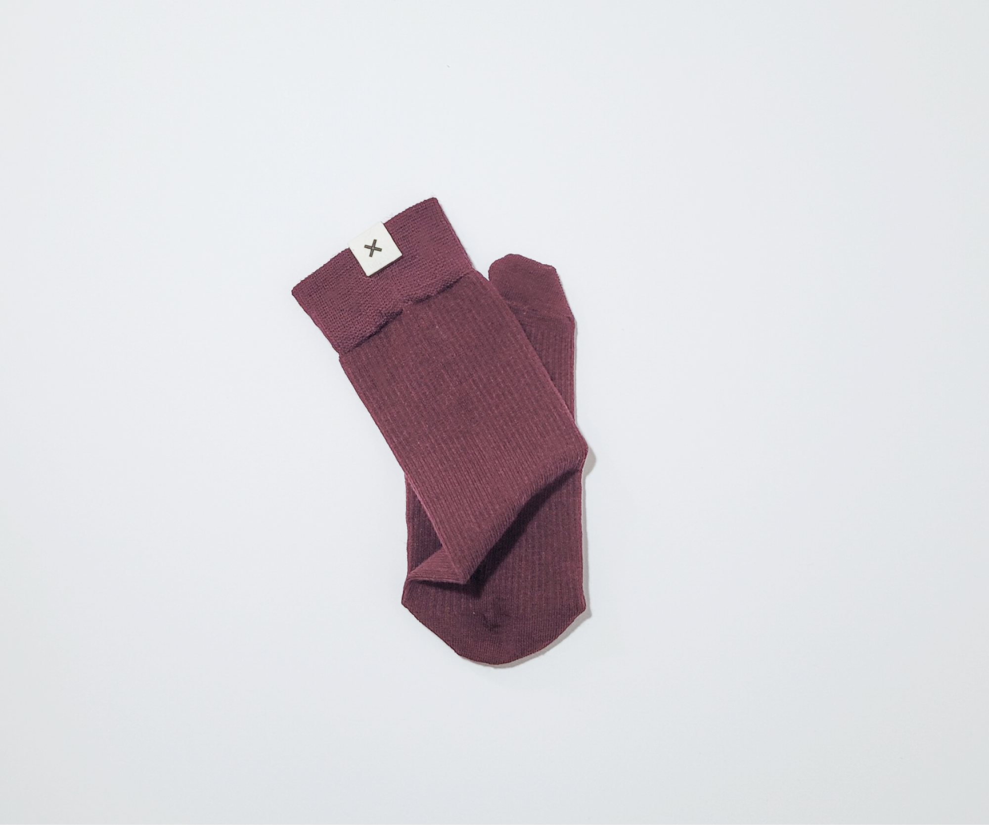
the brief: create a sock brand that reflects duality in every regard: its physicality, its copy and its visual identity. x and o's takes it literally and answers the brief with a wink. tabi socks designed as an inseparable duet: two feet, one pair, no solo acts. the logo divides between left and right, so each sock carries half the mark, and it only becomes whole when the two meet: a brand that quietly reminds you never to lose one. the packaging comes in halves, and the copy is playful and a little bossy, reminding wearers to stay in sync: handle with care, trim your toenails, mend the heels, and stay united. without one another, they aren't a pair.

joseon stamps